Interactive MNIST Application
The MNIST handwritten digits dataset is one of the most iconic when it comes to introducing others to the field of machine learning. At the most basic level, it’s a relatively straightforward classification problem that can be solved with a variety of techniques. My first introduction to neural networks and deep learning was through an MNIST project.
I wanted to take another step in delving a little deeper with what we can uncover about the data, and use this project to showcase techniques and concepts, as the MNIST dataset is already well explored. I was heavily inspired by Chris Olah’s blog on Visualizing MNIST and wanted to do something similar for myself, although this time, allow the user to draw the numbers themselves.
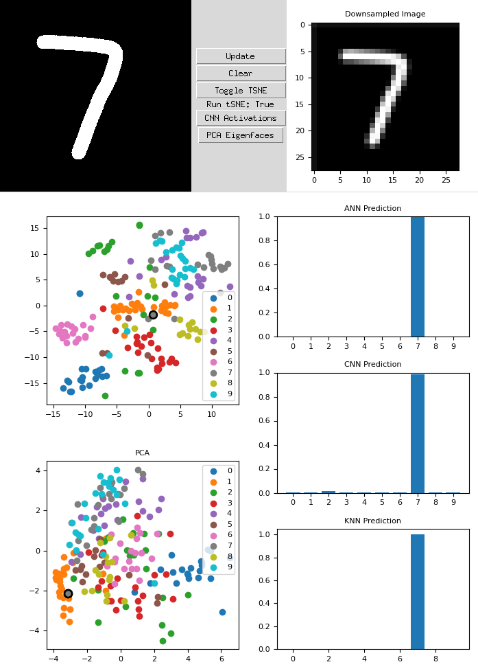
The application allows for users to draw in the left-most black box and outputs the 28x28 downsampled image to the right. This lets us directly see the image going into the various algorithms. There are two direct plots, the top being a t-SNE plot of a subset of the MNIST dataset with the user’s generated image included. The bottom is a plot of the first two PCA vectors, and the same subset of images, along with the user’s number.
The right side contains three different models, a standard artificial neural network (ANN), a convolutional neural network (CNN), and a K-nearest neighbhors (KNN) model. We can see that the current “7” being drawn has been rightly predicted by the models, however, its clustering within the PCA and t-SNE are off. Due to the way I drew the “7”, the diagonal slash correlates very heavily with a “1”.
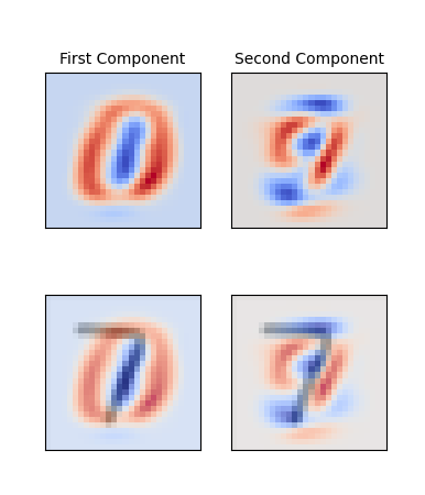
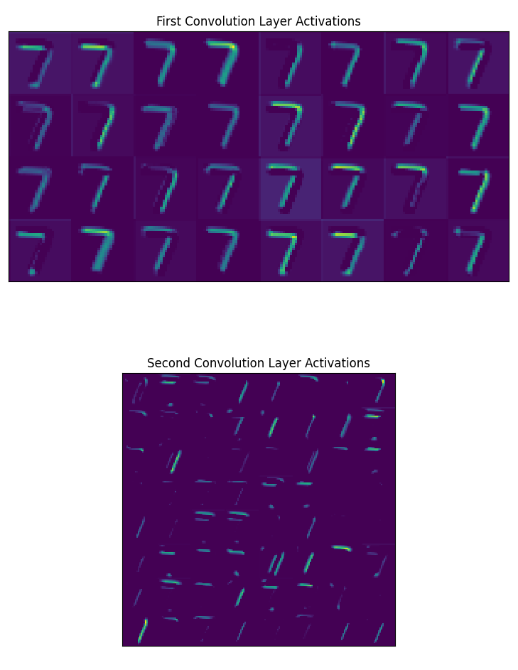
If we open up the PCA Eigenfaces window, we can see what’s going on internally. This method of presentation is the same as Chris Olah’s. By opening the CNN Activations window, we can also see all of the outputs of the convolution layers.
Funky 7
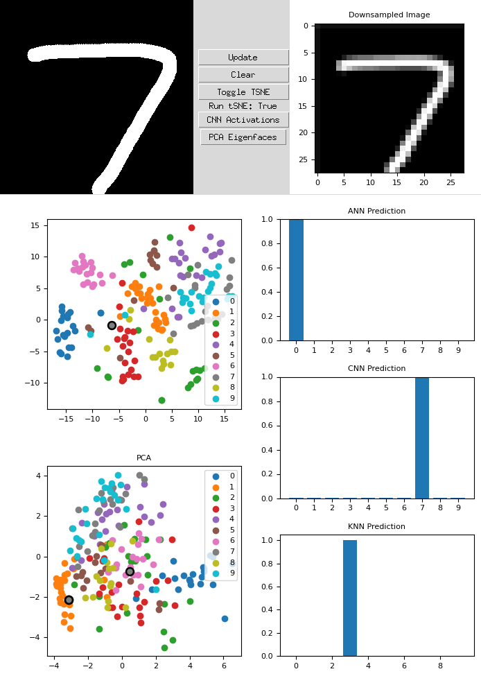
If we take a similar example, except now exaggerate the features of the “7”, we can see how that affects the results of our algorithms. This newly drawn seven is far wider and is pressed further out towards the edges. We can immediately see that the ANN and the KNN wrongly predict the output. The CNN prediction, however, is still correct. On the PCA chart, the new dot is the central gray dot which is clustered near the “6”s.
Let’s see what the eigenfaces and the convolutional layers look like.
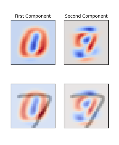
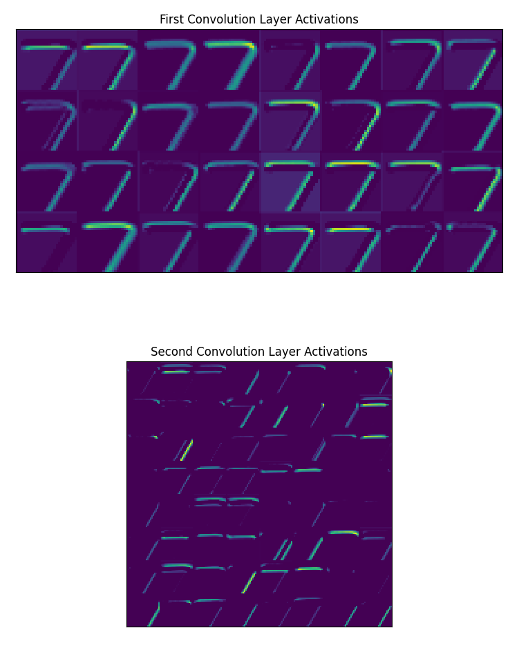
We can see from the eigenfaces window that this new “7” has portions well within the positive components (red). This is what caused the number to have a PCA representation much further center than the original “7”. However, if we look at the convolutional layers, especially the second convolution layers, we can see the two major “components” of the 7, the horizontal and the diagonal portions clearly outlined. This indicates that our convolutional layers are able to pick out those features.
Overall, I believed this deeper delve into MNIST helped me understand the algorithms better, as I could see the detailed effects and behaviors on how they handle these unique inputs. I hope by tinkering around and playing with the details, others can gain additional insights from one of the most well known datasets in the field today.