Visualizing Gradient Optimizers
When we’re talking about the algorithms for optimization, we can’t not talk about gradient descent. It’s one of the most intuitive algorithms that are used to introduce the field of optimization. Its application reaches from the convergence of physical simulations to, as you’d expect from the topics on this site, machine learning. One problem I recognized while learning the concept for the first time was how many sources and visuals there were of the most basic form of gradient descent, but when we start talking about modified versions such as stochastic gradient descent (SGD), momentum, root-mean-squared propagation, and Adam, the visuals start making less sense. We rely heavily on the maths and the abstraction of the original concept to understand how these modifications affect the behaviors of these optimizers. I wrote the following in a jupyter notebook to better my own understanding.


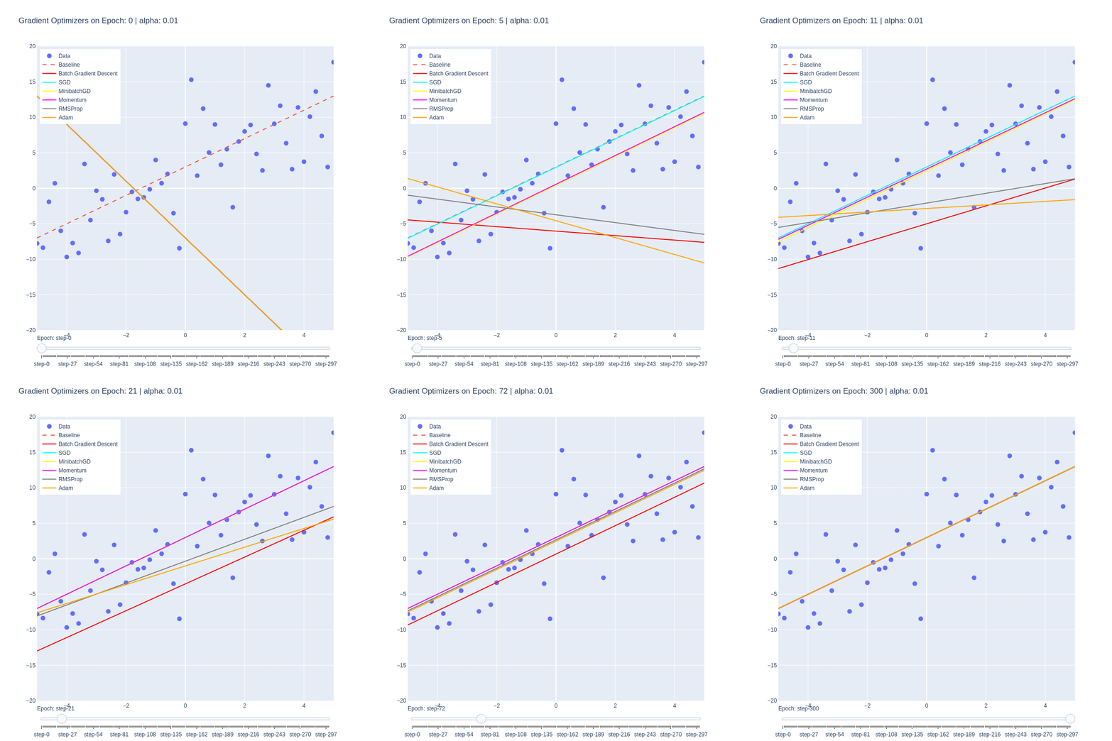
Although the function itself is a simple linear function, it manages to illustrate some of the behaviors of each optimizer. We notice that the base form of gradient descent, Batch Gradient Descent (red) is the slowest to converge. This is due to the low number of updates to the weights, as each epoch only updates the weights once. Despite the optimality of the update, the low number of updates means it takes the algorithm the highest number of iterations to converge.
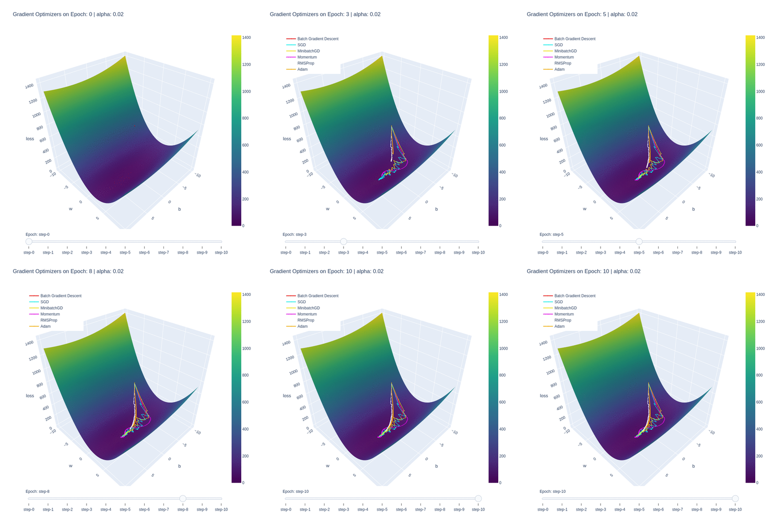
This is in contrast to Stochastic Gradient Descent (SGD), which updates the weights M-times per epoch, M being the number of training examples. This allows for the optimal function to be found extremely quickly, within a few epochs. The drawback is, as shown in the first plot, the path to reach the minima is varied and chaotic. This makes SGD susceptible to oscillating around a local optima, and due to the stochastic nature, dependent on the order of training examples.
We see that Minibatch Gradient Descent, is a balance between the two, being both faster than BatchGD, and more stable than SGD. Further additions such as momentum allows for the optimizer to behave like a ball rolling down the hill with momentum. We can see it on the path (purple) on the loss plot, and those same oscillations are mimicked on the functional convergence plot. The purple line seems to wiggle back and forth around up to epoch 10, which is indicative of the momentum.
Root-mean-squared propagation serves to provide a better path towards the optimum by scaling the weights and therefore ensures that regardless of the magnitude of the weights and their effects to the loss, they’re treated similarly in terms of updating the parameters. We see ADAM take both RMS and momentum to smoothen the path that RMS took.
It’s important to note that this simplified cost function doesn’t have any local minima, and so some of the benefits of momentum are lost. Changing the cost function to contain this behavior could impart further insight into the nuances of these optimizers.
The Jupyter Notebook
If you’d like to read more about gradient optimizers, check out my jupyter notebook. It contains all the code used to make these plots, as well as a deep dive into the mathematics and implementations of each of these optimizers. It also contains further references to help you understand exactly how these optimizers work.